Meet Six Central Florida Designers and Builders
These six Central Florida designers and builders have embarked on many challenging—and fun—assignments throughout their careers. Here, they reveal some of their favorite rooms.
Phil Kean, President, Phil Kean Design Group
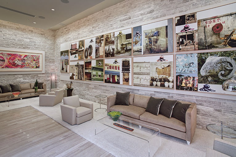
This Winter Park house, built in 2012, was one of the first projects Phil Kean did that was really well-received. “There are so many things I like about this room,” Kean says. “It felt like you could be anywhere in the world. It had an international feel to it.”
The stone wall features a collection of 12 prints by American artist Robert Rauschenberg, which were curated and installed by an art gallery in New York. Says Kean: “That room always felt special because you were surrounded by world-class art. It was refined and elegant with a certain edginess.”
And it was a great room for entertaining, with access to the outside and a built-in bar that featured a statement piece by a glass artist.
Because the artwork was the overall star of the room, Kean always intended to use a neutral palette. The flooring is a linear-cut limestone, randomly laid in a wood floor pattern. “I think it turned out much better than we first thought,” he says. “And I took the limestone flooring outside as well.”
The piano was a family heirloom. “The acoustics in this room were fantastic. The piano sounded so beautiful in that space. Overall, I like that room enough to do it again,” he adds.
John McClain, Owner/Principal, John McClain Design
When John McClain and his design team initially surveyed their clients’ home, the first thing the homeowner said was, “This is where I want to be on Sunday afternoons.” McClain notes: “Living in a Florida lake home is all about the view. We captured and framed that view through magnificent custom draperies and strategic furniture placement.”
The space needed to be multifunctional. One of their clients wanted the area to entertain guests, while the other imagined long weekend naps enjoying the view and basking in the breeze. “We honored both requests by facing a comfortable bench seat sofa upholstered in outdoor-rated onyx velvet across from two stylized wing chairs, creating an ideal layout for conversation and hosting,” McClain says.
“Our team kept a restrained color palette of black, white, gray and gold. The true art of the home is nature, which we wanted to respect and highlight. The organic outdoors is perfectly juxtaposed to the elegance of the indoors.”
Ashley Sheaffer & Adam Vellequette, Principals, KBF Design Gallery
“Prior to the remodel, this master bathroom had a standard double vanity, a free-standing bathtub and standard-size shower,” notes Ashley Sheaffer. Their clients’ wish list included two separate vanities and an expansive shower, rather than a bathtub.
The floorplan had to be reimagined, and the plumbing rerouted. “We were able to incorporate two large vanities, providing a great amount of counter space and storage,” Sheaffer says. The new floorplan also included a linen closet and a 10’ x 5’ double-door entry shower boasting handheld and rainfall showerheads, bench seating and deep-niche shelving.
The KBF team used a palette of soft white and gray, adding warmth and a little sparkle with champagne bronze fixtures and satin brass hardware. Large-format tile was chosen for the flooring and shower walls, helping to visually enlarge the space. Quartz countertops, undermount sinks, and the clear glass shower enclosure kept the look streamlined and bright.
“This master bathroom is one of our favorites because of how well it reflects our clients’ wishes, how it blends so seamlessly with their existing home while feeling both modern and timeless, and how we were able to pack so much function into the space,” Sheaffer says.
Audrey Morrone, Owner/Principal, Morrone Interiors
Last year, Audrey Morrone and her team completed the redesign on this mid-century modern home on Lake Fairview in College Park. “It had been pretty much untouched since the 1960s,” Morrone says. “We wanted to keep a lot of the original characteristics, while updating it to the present day.”
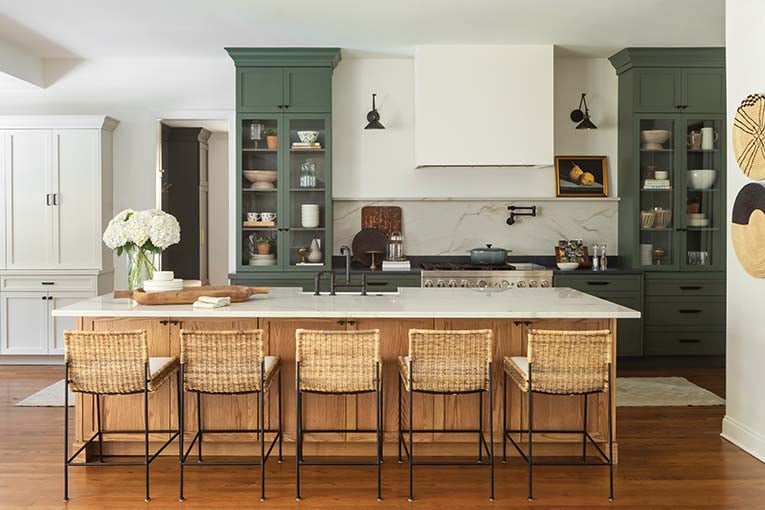
For the kitchen, she took down some walls to open up the space and added the island with a waterfall countertop. “I took the same quartz that you see on the countertops and the island and ran it up the back wall,” she notes. The original design of the house had a pass-through that lead to a bar in the family room, which Morrone decided to keep for ease of entertaining.
The light oak cabinetry with geometric-styled, brushed gold-tone hardware maintained the kitchen’s 60s vibe, but with a modern twist. “It was fun and interesting to be able to design something from that decade,” Morrone says.
Krista Agapito, Director of Sales, S&W Kitchens Inc.
“This dining room is a true transition piece from the kitchen to the living room,” says Krista Agapito. “The cabinetry mirrors the dark black accents in the kitchen, helping to create a cohesive and organic feel. The full-length glass doors make this display area feel inviting and less formal.”
As for the look, the goal was modern, organic, simple. Light and open. “A collaboration with a large multifaceted team working together with the very-involved client achieved all the details. Wood grain and high-contrast, black, textured cabinets in lieu of the ever loved ‘white cabinet’ gave a warm and welcome feeling to this dining room,” Agapito adds.
Near the end of the project, the client worked with interior designer Ashley Martin to help with the finishing touches. Says Agapito: “Working together at the end of the project was a lot of fun to ensure a space that felt cohesive and met all of the client’s wishes.”
Susan Pridgen, Owner/Principal, PB Interiors
Pridgen’s favorite space was the dining room of a Winter Park house she did about three years ago for the Parade of Homes. “It has a traditional look to it, but also a clean, contemporary vibe,” Pridgen says. She particularly likes the wide molding and the crystal light fixture (it’s 72” long and 10” wide) over the table, which she found at Restoration Hardware.
The builder, Ira Kitograd of IBK Construction, installed tall windows on two sides of the room, “so of course I wanted to incorporate the blue reflection from the pool so the room would look like an extension of the outdoors,” she says. The rug has an ombre effect and gives the illusion of movement in water.
“I went with a wide plank oak with a dark stain for the floor. The house had a lot of glamour and an oak floor to me is kind of timeless,” Pridgen says. On the solid wall is a painting by the late local artist Paul Scarborough. Opposite sits a contemporary bar cart in polished nickel by Regina Andrew, which balances the room.
“The only thing I would’ve done differently for this room is drapes,” says Pridgen.


